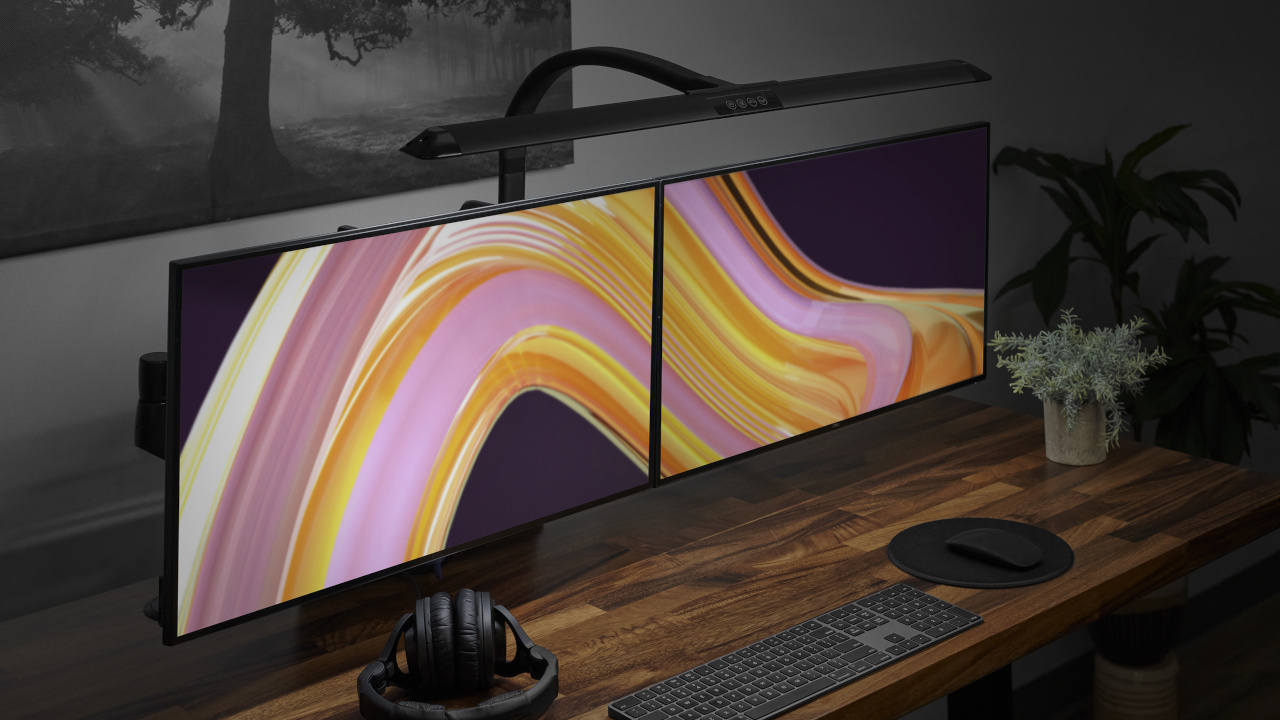
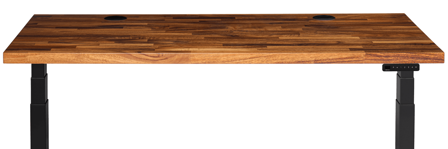
Hero Section - Above
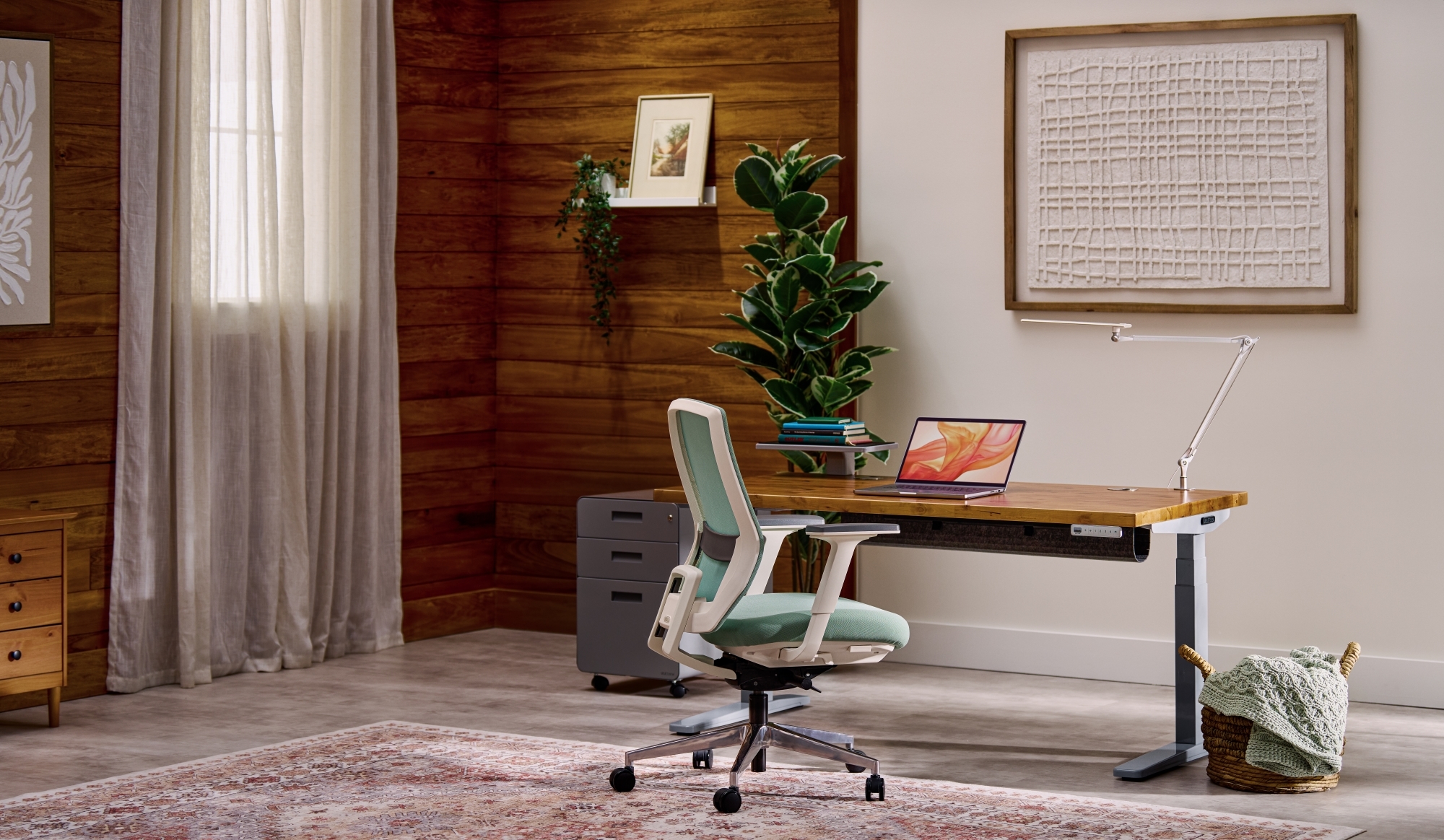
This component serves as the primary visual anchor for the top of a page. It features a full-width background asset (image or video) overlaid with a large headline, an optional short description, and a primary CTA button. Additionally, the layout includes a dedicated trigger in the bottom-right corner designed to launch supplementary media, such as a "Behind the Design" video modal.
Bento Layout Sections
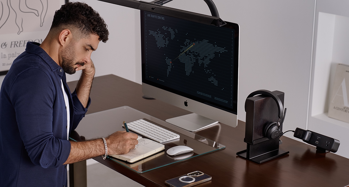
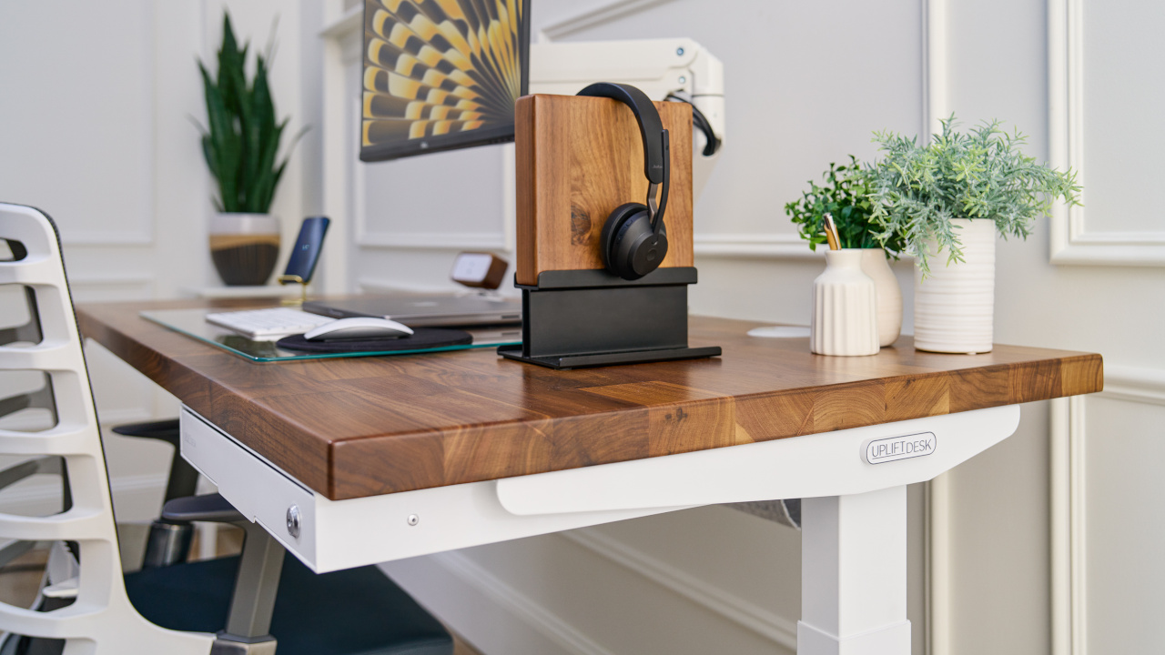
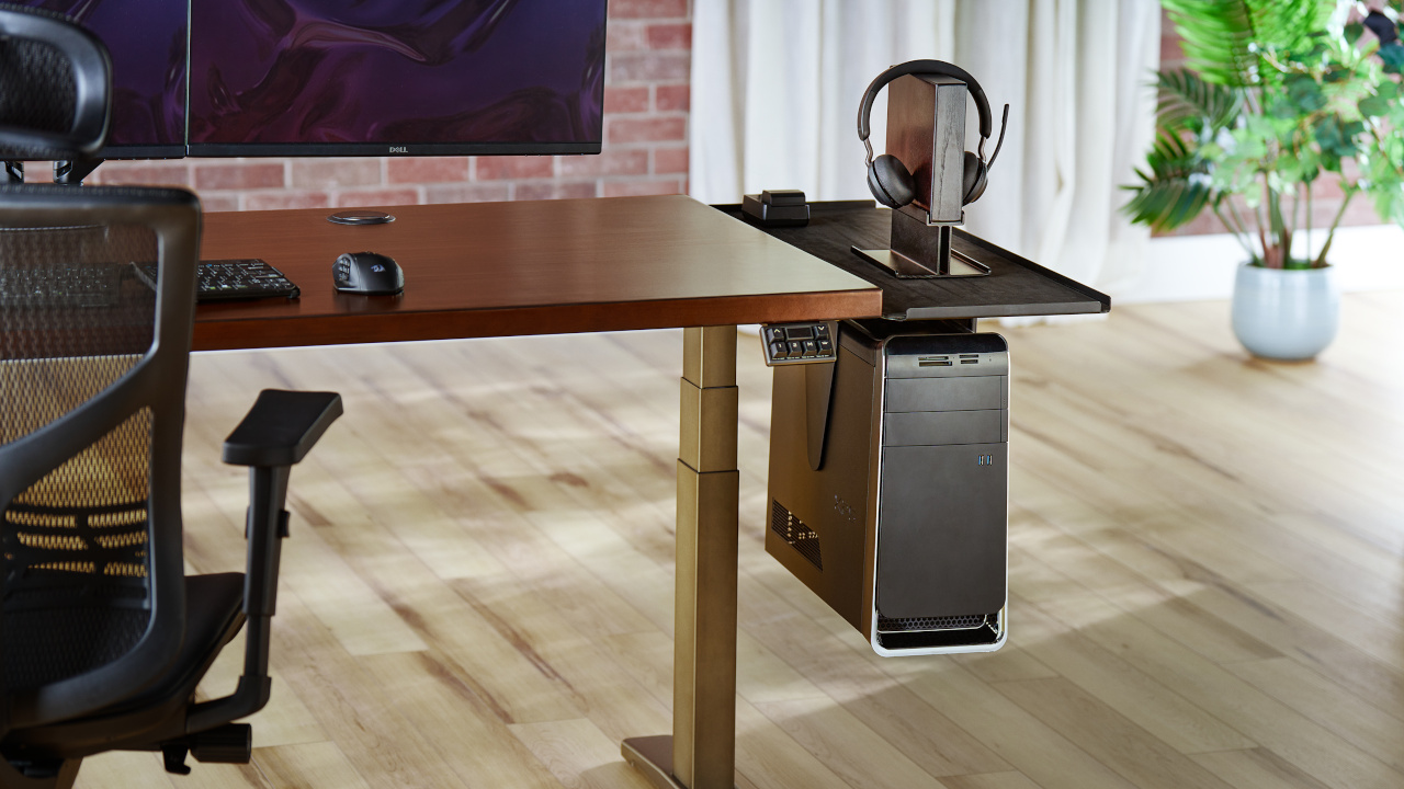
This bento-style carousel showcases content in a dynamic, repeating layout. Each 'set' features one tall, vertical card alongside two smaller, stacked cards. Authors can add up to 10 cards in total, with each card supporting flexible media like images, videos, or focal-point images. On mobile, the carousel adapts by scaling the cards down while preserving their original aspect ratios.
Heading

Compact Slider Section
This slider provides a flexible, compact carousel for up to 10 content cards. Its signature feature is a modern glass overlay that can be customized with an optional heading, description, or CTA. This "opt-in" content model allows for both information to be overlayed or image-only cards within the same component. Each card supports images or videos and maintains its aspect ratio when scaled on mobile.
Heading
Wide Slider Carousel Section
his slider provides a wide-format carousel for up to three content cards. The structure is fully opt-in, meaning both the main section heading and the individual card’s glass overlay can feature content or not. This flexibility allows cards to display detailed content (Icon, Title, Description, and CTA) or appear as standalone background images or videos without any text overlay.
Wide Slider Carousel
Content List
This full-screen component serves as an interactive page break for content. It features a numbered vertical list where clicking an item dynamically updates the background image and the associated description text. This design allows users to cycle through related media and text within a single, fixed view.
Description
Content List Sections
This component pairs a main media container with an interactive list. Clicking an item in the list dynamically updates the displayed image or video and the accompanying description text. This structure functions similarly to a tab system, allowing users to cycle through multiple content pieces within a single view. Can be left or right aligned.
Has two display options - no foreground and foreground
Content List, Left
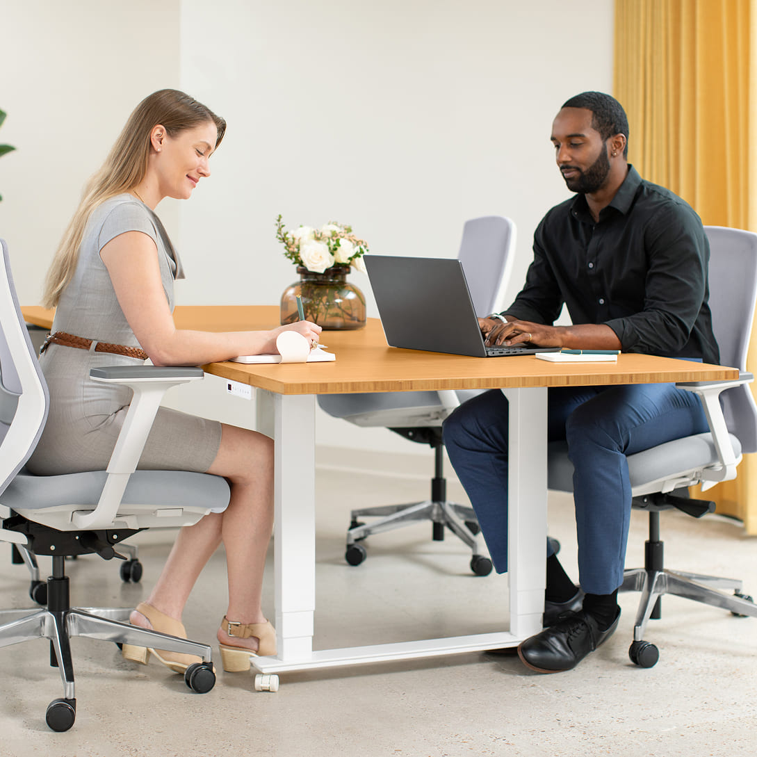
UPLIFT Desk offers complimentary office space planning for workplaces of any size, from 4 to 4,000+. Begin by contacting our Sales Professionals to identify your needs, then let our certified space planners create tailored office designs integrating ergonomic principles, corporate aesthetics, and technical infrastructure.
The result is a well-planned office environment that enhances productivity, supports well-being, and reflects organizational values.
Learn moreContent List, Right
UPLIFT Desk offers complimentary office space planning for workplaces of any size, from 4 to 4,000+. Begin by contacting our Sales Professionals to identify your needs, then let our certified space planners create tailored office designs integrating ergonomic principles, corporate aesthetics, and technical infrastructure.
The result is a well-planned office environment that enhances productivity, supports well-being, and reflects organizational values.
Learn moreTransform your team's office
UPLIFT Desk offers complimentary office space planning for workplaces of any size, from 4 to 4,000+. Begin by contacting our Sales Professionals to identify your needs, then let our certified space planners create tailored office designs integrating ergonomic principles, corporate aesthetics, and technical infrastructure.
The result is a well-planned office environment that enhances productivity, supports well-being, and reflects organizational values.
UPLIFT Desk provides industry-leading ergonomic furniture and accessories to federal, state, and local government agencies and organizations throughout the U.S.
Place your order online through the GSA Advantage website or buy direct from us.
Explore real-world case studies of companies transforming their work environments for productivity, comfort, and employee wellness. Then get in touch with our team so we can transform your team's office.
Foreground Content List, Right
Explore real-world case studies of companies transforming their work environments for productivity, comfort, and employee wellness. Then get in touch with our team so we can transform your team's office.
Learn moreExternal Comparison Chart
This component renders a comparison matrix to evaluate features or specifications. It supports a grid layout of rows and columns, utilizing text and status icons (such as checks and Xs) to indicate feature availability. One column can be designated as the primary focus, receiving visual emphasis to distinguish it from the comparison data.
External Comp. Chart
Description
Other standing desk brands
Amazon brands
Swatch Carousel Section
This component functions as an interactive selector for material or product variations. It features a rotating carousel where clicking a specific swatch brings it to the center focus position. The bottom tab navigation allows users to switch between different content categories. State changes between these categories utilize staggered animations to ensure smooth transitions and prevent content flashing.
Swatch carousel
Laminate
Our most popular desktop. Greenguard-Gold certified laminate desktops resist scratches and stains, making them well-suited for high-traffic environments.
Press Quote Section
This component pairs a central text display with a horizontal row of interactive logos. It functions as a content switcher: clicking a logo dynamically updates the main quote text to match the selected brand. This design allows for multiple testimonials or press mentions to be displayed in a single, fixed view without requiring a carousel slider or scroll interaction.
Press Tab
“Press quote 2”
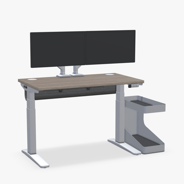
Product Gallery - Option 1
This component utilizes a split-layout strategy to differentiate visual context. The left column is designed for immersive "lifestyle" photography (showing the item in an environment), supported by a thumbnail navigation strip. The right column functions as a product specification panel, featuring an isolated product image, descriptive text, and a dedicated CTA button for immediate interaction.
Subheading, accent
Product Gallery, Default
Description
Heading
Description
Heading
Description
Heading
Description
Heading
Description
Heading
Description
Product Gallery Section - Split view
A dual-column media section that adds carousel functionality to the product display. The left column presents lifestyle context, while the right column features an isolated product slider equipped with left/right navigation arrows. This setup allows the product image, heading, and description to be cycled through while keeping the CTA accessible.
Heading
Description
Heading
Description
Brand Proof Section
This component features a continuous, horizontal marquee designed to display a large volume of logos. The logo cards automatically scroll across the viewport without requiring user navigation or interaction. This "ticker" style layout allows for an infinite loop of brand assets to be displayed within a fixed vertical space.
Review Slider Section
This component combines a primary summary card with a horizontal carousel of review entries. The lead card (shown in blue) serves as the section anchor and is fully customizable with its own title, subheading, description, and CTA. Following this anchor is a series of standard review cards, each containing a product image, star rating, review text, and customer details.
Review Slider
X/5
Subheading
Description
Review Heading
Review Description
Satoru G.12.25.18
Review Heading
Review Description
Suguru G.12.25.17Showcase Section
This component acts as a high-level product overview section. It features a centered header structure that supports a heading, subheading, and two distinct Call-to-Action (CTA) buttons. Below the navigation, a horizontal row displays text-based feature descriptions (supporting up to 8 items), which sit directly above a large-scale product image anchor.
Showcase Layout
Subheading
Feature 1
Feature 1 Copy
Feature 2
Feature 2 Copy
Feature 3
Feature 3 Copy
Feature 4
Feature 4 Copy
Internal Comparison Chart Section
This component organizes product groupings using a top-level tabbed navigation system. It supports up to four distinct tabs. Selecting a tab updates the section heading and renders a specific set of two product cards. Each card is structured to hold a product image, title, description, pricing, star rating, and a CTA.
Heading 1
24" Custom Laminate Desktop
Choose from our premium Custom Laminate Desktops for a unique look.
$959
Rating

24" Walnut Laminate Desktop
Our best selling desk frame, fit for your workspace.
$699
Rating
FAQ Section
A question-and-answer section featuring a stack of interactive text drawers. Users can click to reveal answers, with each item operating independently of the others (allowing multiple to be open at once). By design, the first item renders in the expanded state automatically.
FAQs
Lorem ipsum dolor sit amet consectetur adipiscing elit quisque faucibus ex sapien vitae pellentesque sem placerat in id cursus mi pretium tellus duis convallis tempus leo eu aenean sed diam urna tempor pulvinar vivamus fringilla.
Lorem ipsum dolor sit amet consectetur adipiscing elit quisque faucibus ex sapien vitae pellentesque sem placerat in id cursus mi pretium tellus duis convallis tempus leo eu aenean sed diam urna tempor pulvinar vivamus fringilla.
Lorem ipsum dolor sit amet consectetur adipiscing elit quisque faucibus ex sapien vitae pellentesque sem placerat in id cursus mi pretium tellus duis convallis tempus leo eu aenean sed diam urna tempor pulvinar vivamus fringilla.
Lorem ipsum dolor sit amet consectetur adipiscing elit quisque faucibus ex sapien vitae pellentesque sem placerat in id cursus mi pretium tellus duis convallis tempus leo eu aenean sed diam urna tempor pulvinar vivamus fringilla.